All work
Nostalgia, Reworked
- Client
- Clayoven
- Industry
- Restaurant / Food & Beverage
- Scope
- Brand Identity · Social Media · Content Design · Reel Editing
A visual identity and content system built around Clayoven's restaurant heritage, translated into social content and motion.
- Client
- Clayoven
- Industry
- Restaurant / Food & Beverage
- Scope
- Brand Identity · Social Media · Content Design · Reel Editing
A visual identity and content system built around Clayoven's restaurant heritage, translated into social content and motion.
Brand identity
Navy, cream, gold and black, set in Playfair Display and Lato, with archival textures for the Nostalgia theme.
Logo
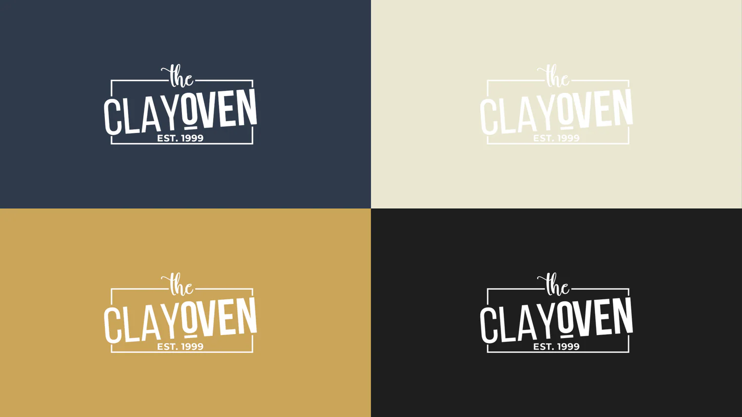
Logo on brand colours
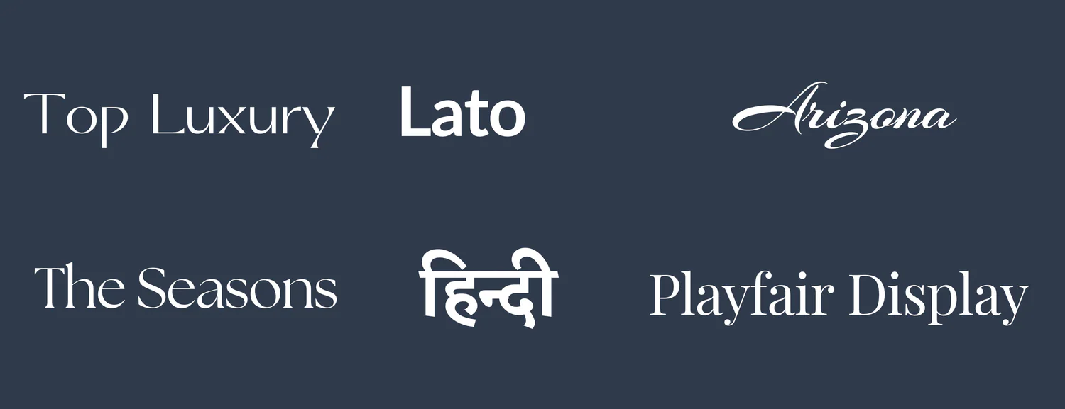
Typography
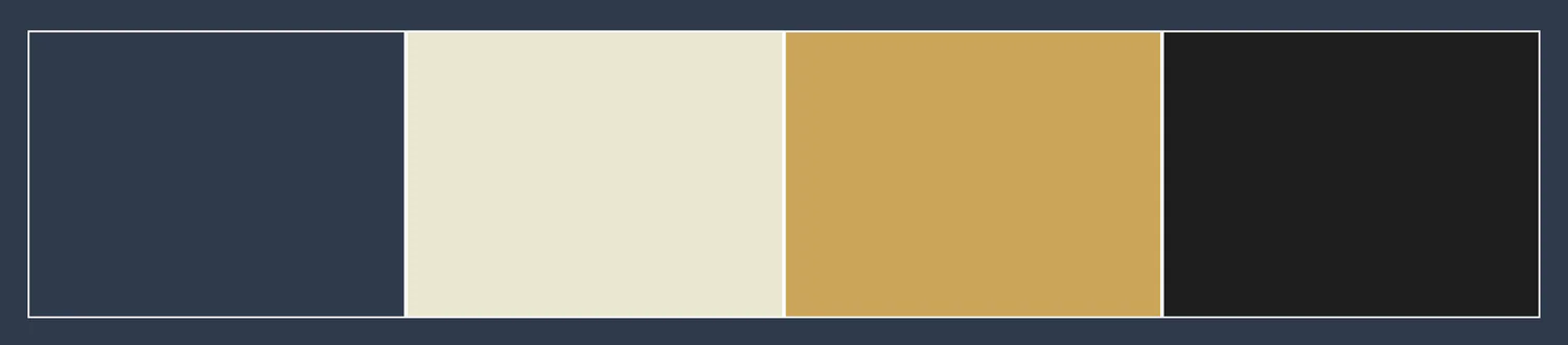
Colour palette

Texture I
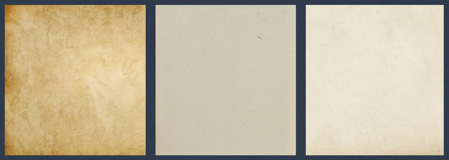
Texture II
Visual language
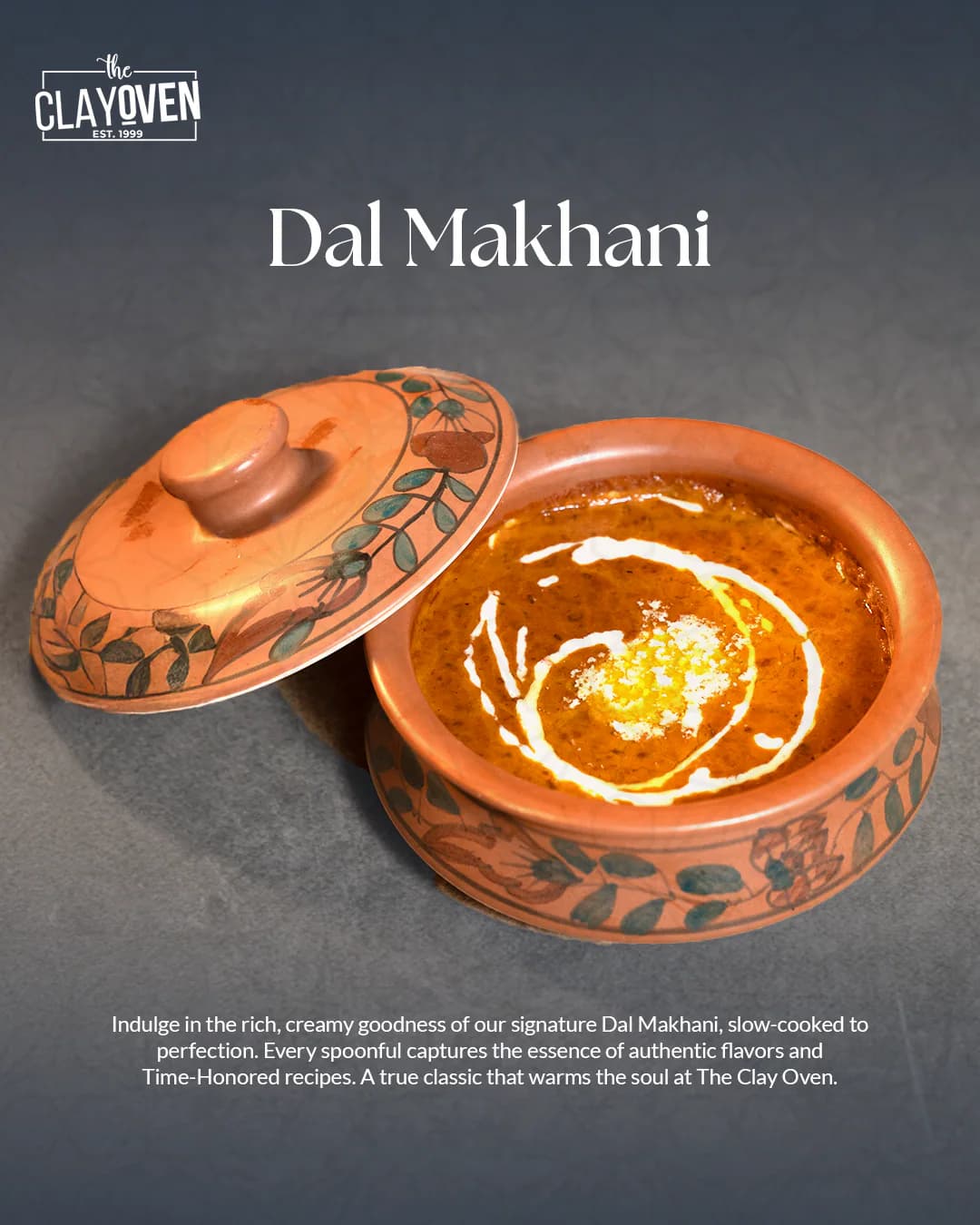
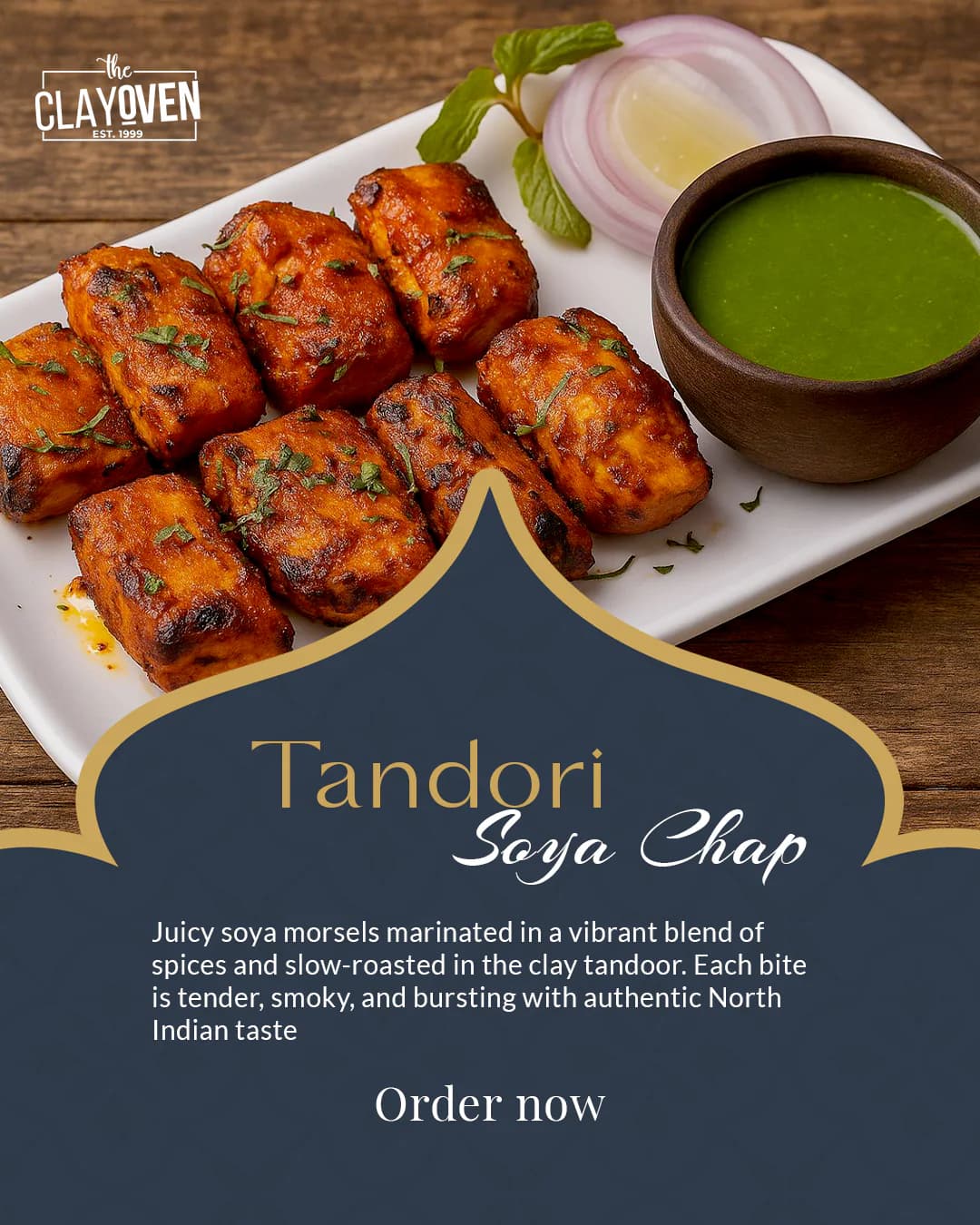
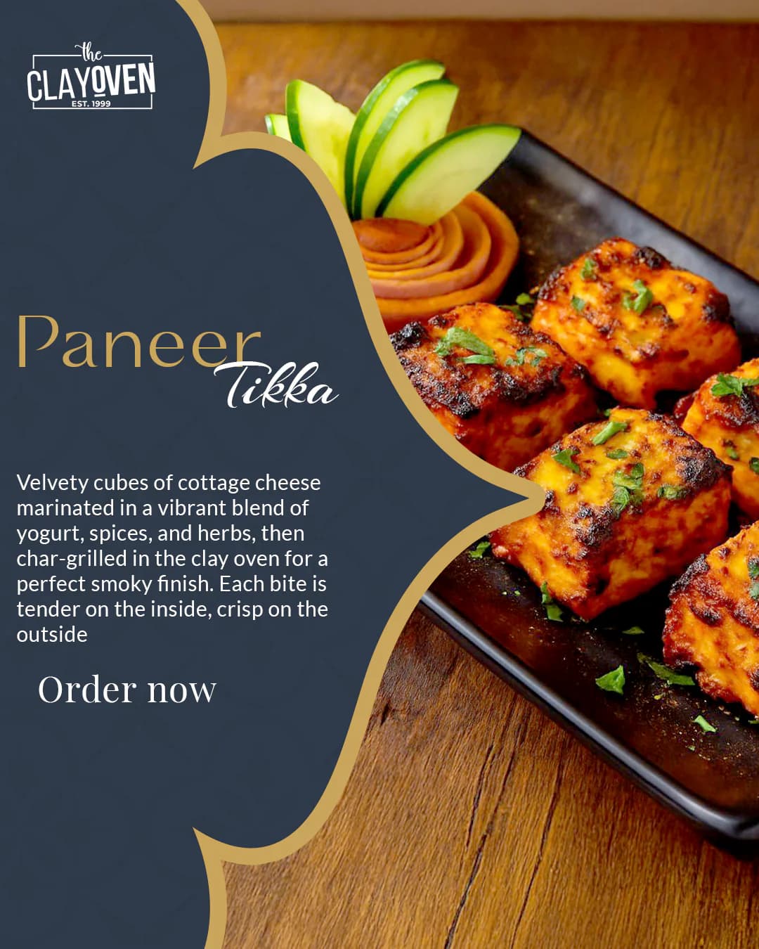
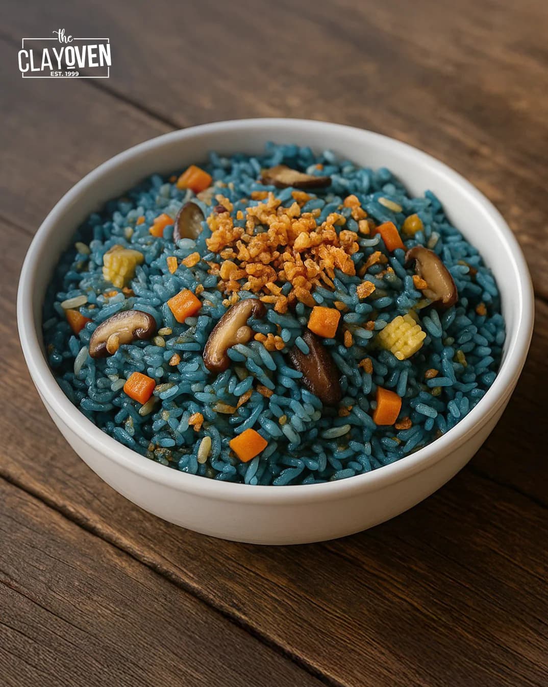
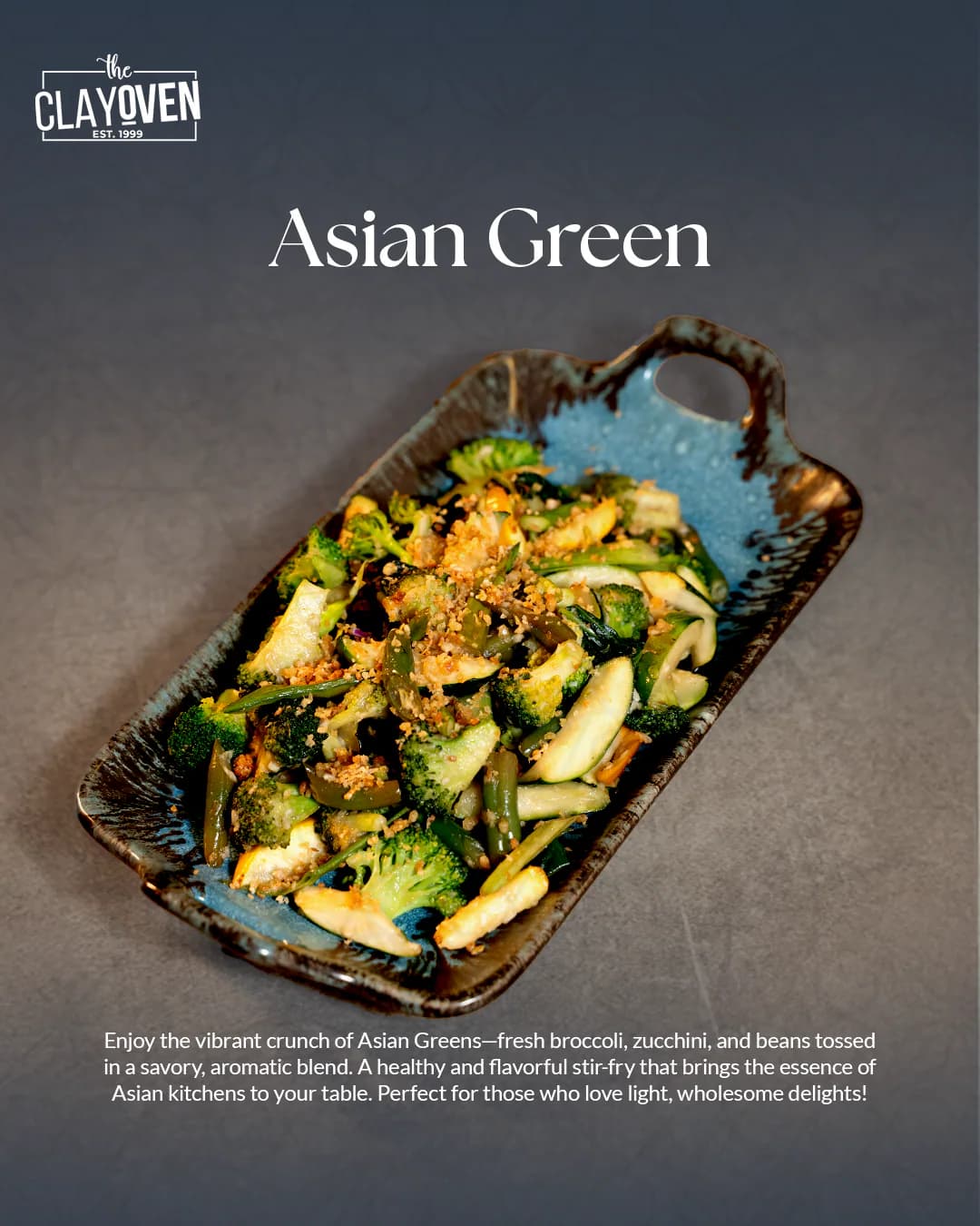
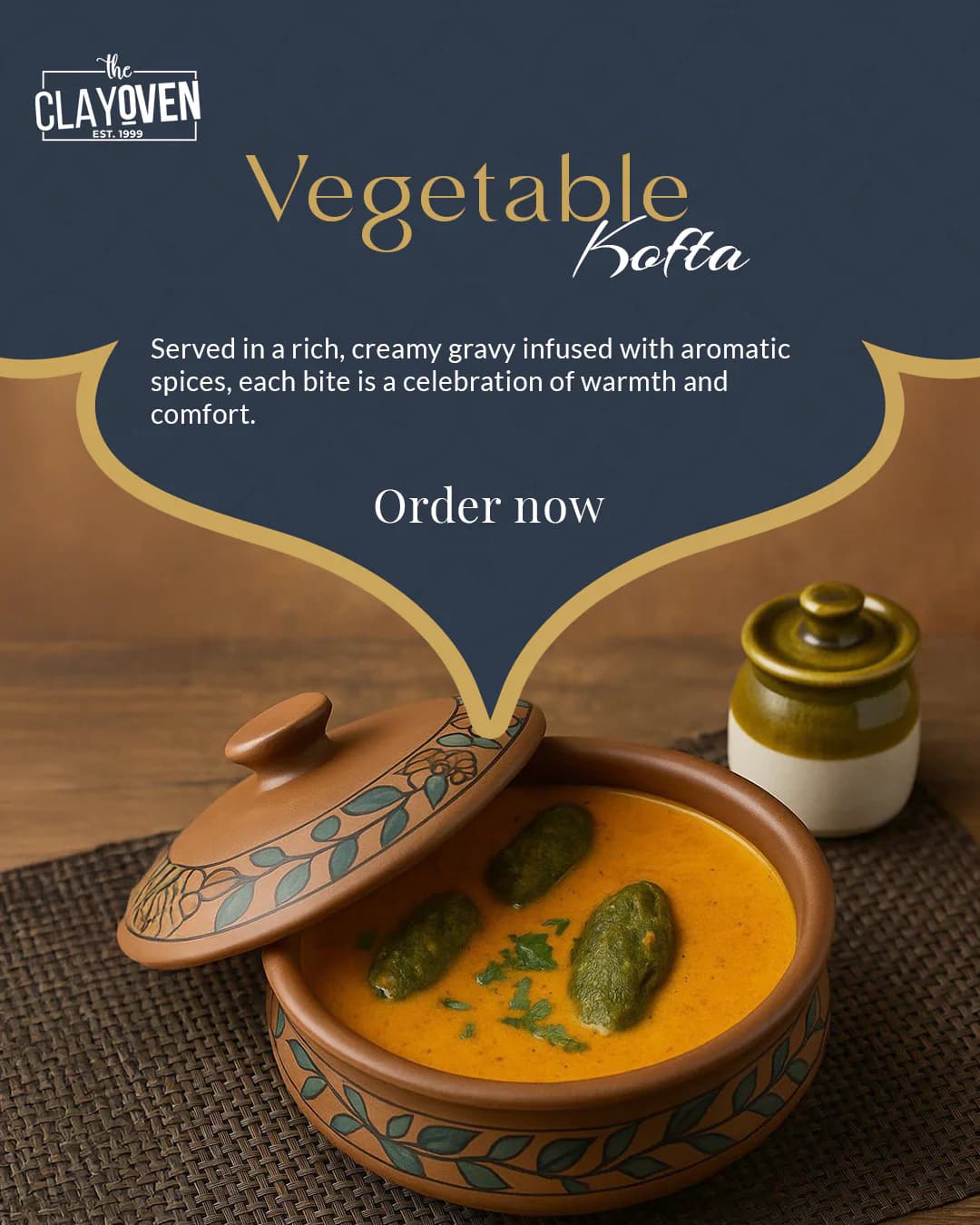
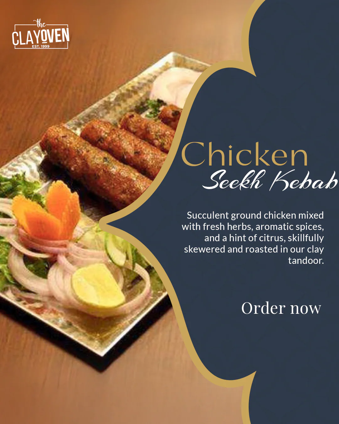
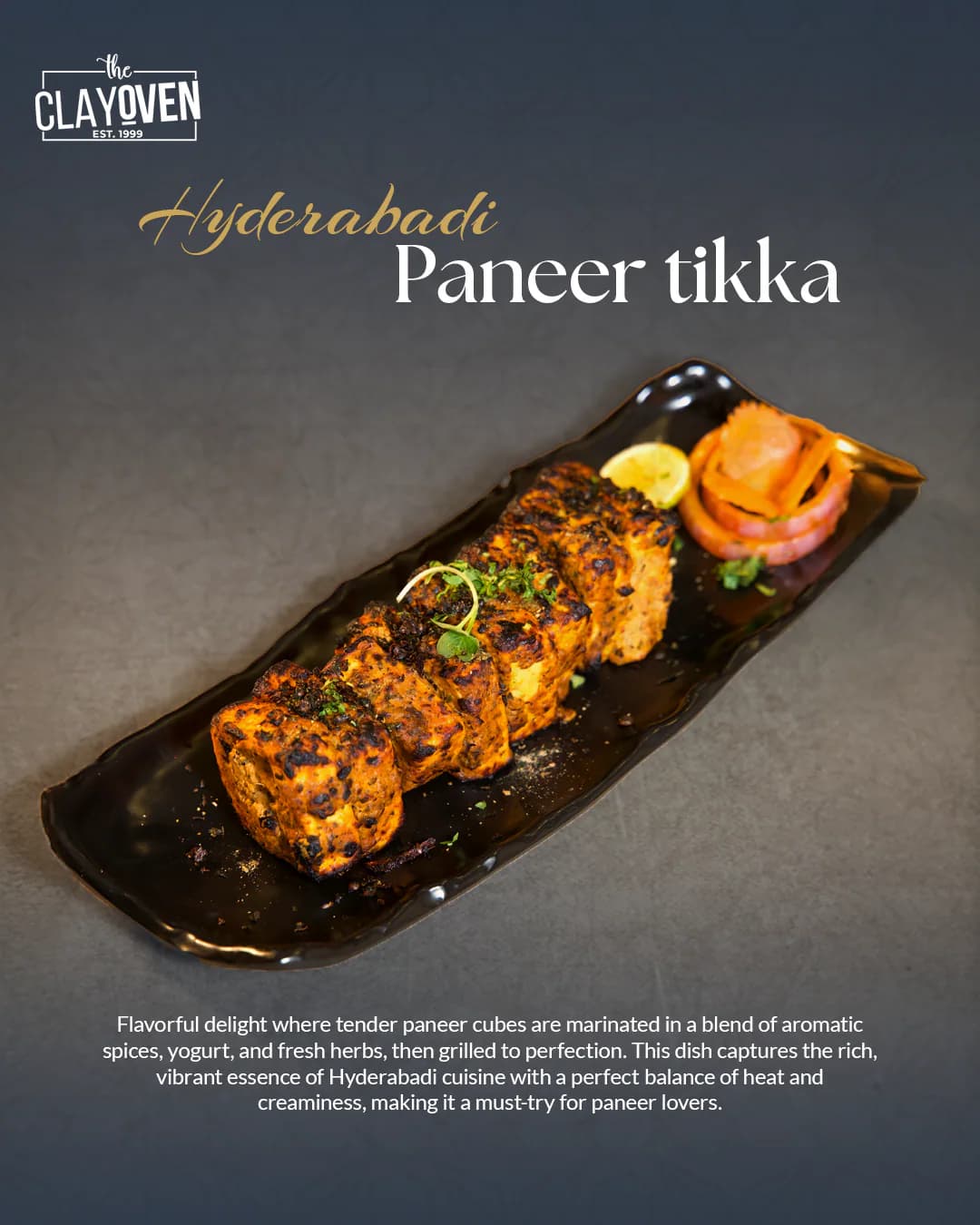
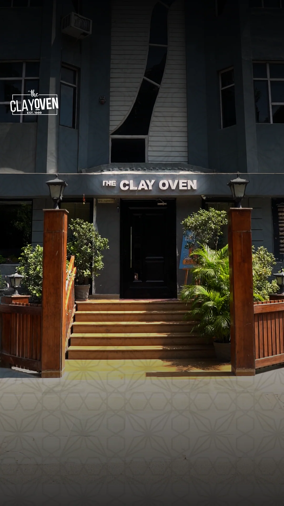
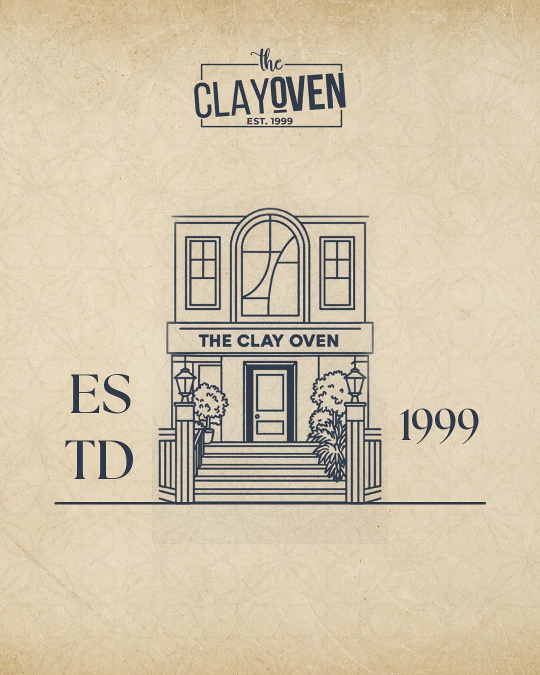
Photography, typography, framing and heritage-led details were brought together into a repeatable social visual language.
Motion / Reel
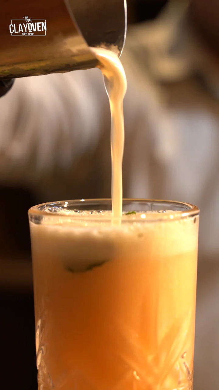
Cocktail Reel
Extending the visual language into motion through food, atmosphere and pacing.
Ending
A legacy, recast.
Social media
Grid 01
Grid 02